...
The easiest way to see how the Form Grid works is to use the existing built-in App Expenses Claims and create a new form to mimic an existing form in the app. Here are the steps:
...
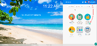
Figure 1

Figure 2

Figure 3

Figure 4
...
- Start the Joget Server and open the App Center.
- Log in as admin and click on the pencil icon on the Expenses Claim to open the Design App. (see Figure 1)

Figure 1 - Under FORMS column, click on Expense Claim Form (see Figure 2)

Figure 2 - Drag and drop the Form Grid element on to the canvas.
- Hover the mouse over the Form Grid element on the canvas and click on Edit to open up the Edit Form Grid properties.
- Fill up the Edit Form Grid properties as follows and click on OK (see Figure 3):
- ID: entries
- Form: Expense Claim Entry
Columns :
Field ID*
Label
Format Type
date Date Date category Category purpose Purpose amount Amount Decimal 
Figure 3
- Click on Preview to open up the Preview tab, click on the plus sign on the Form Grid and it will open up a popup displaying the Form that it was referred to. (see Figure 4)

Figure 4 - Open up Expense Claim Entry and note the Field ID's are the same as written in the Edit Form Grid. This is how the Form Grid displays the data from said target form. (see Figure 5)
...

Figure 5
Form Grid Properties
Edit Form Grid
| Name | Description | ||||||||||||||||||||||||||||||||||||||||||||||||||||||
|---|---|---|---|---|---|---|---|---|---|---|---|---|---|---|---|---|---|---|---|---|---|---|---|---|---|---|---|---|---|---|---|---|---|---|---|---|---|---|---|---|---|---|---|---|---|---|---|---|---|---|---|---|---|---|---|
| ID | Element ID (By declaring as "entries", a corresponding database table column "c_entries" will be created) Please see Form Element for more information about defining the ID and list of reserved IDs. | ||||||||||||||||||||||||||||||||||||||||||||||||||||||
| Label | Element Label to be displayed to the end-user. | ||||||||||||||||||||||||||||||||||||||||||||||||||||||
| Form | Target form to refer to. | ||||||||||||||||||||||||||||||||||||||||||||||||||||||
| Columns | The columns defined here must be correspondent to the Form chosen above.
|
UI
Sorting
| Name | DescriptionScreen (Click to view) | |
|---|---|---|
| Enable Sorting Feature | Determines if the ordering of rows is to be enforced. The property fields "Enable Sorting Feature" and "Field ID for Sorting" stores the form grid record row sequence, meaning it records which ID sits in row 1, row 2, and so on and rearranges it back in this same ascending sequence on load binder. If you are using this property, key in a unique field ID in "Field ID for Sorting" property . This field ID must *not* be an existing field in your form which you use for your form data. Typically we use the field ID "sort" and Joget will automatically create this column in your database table (Do not use the field ID "sort" anywhere else in your form). If you need automatic sorting on another column value when loading the form grid/spreadsheet, use Load Grid Data with Custom Sorting and Filtering or JDBC Form Binder with the "... ORDER BY ASC" SQL statement. | |
| Field ID for Sorting | Field to keep the ordering sequence; must correspond with a field id (i.e. hidden field) to keep the sequence number (i.e. 0,1,2,3,4) in the target form. |


Form
| Name | Description | Screen (Click to view) | ||||
|---|---|---|---|---|---|---|
| Form Submit Button Label (Normal Mode) | The label of the Submit button in normal mode. | |||||
| Form Submit Button Label (Readonly Mode) | The label of the Submit button in read-only mode. | |||||
| Display field as Label when readonly? | Displays the value of the element as plain text when an element is set to "Readonly". | |||||
| Popup Dialog Height | Specifies the height, in characters.
| |||||
| Popup Dialog Width | Specifies the width, in characters.
|


Grid
| Name | DescriptionScreen (Click to view) | |
|---|---|---|
| Readonly | Determines if the element is editable. | |
| Disable Add Feature | Determines if a new row can be added. | |
| Disable Delete Feature | Determines if a row can be removed. | |
| Delete confirmation message | Confirmation message when deleting a row. | |
| Show Row Numbering? | Shows numbering on the grid. | |
| Paging Size | Items to be displayed per page. |


Validation & Data Binder
Validation
| Name | Description | Screen (Click to view) | ||||||
|---|---|---|---|---|---|---|---|---|
| Validator | Attach a Validator plugin to validate the input value. Please see Form Validator.
| |||||||
| Unique Column | Column/Field ID to identify record ID. | |||||||
Min Number of Row Validation (Integer) | Min Number of Row Validation (Integer) | |||||||
Max Number of Row Validation (Integer) | Max Number of Row Validation (Integer) | |||||||
Error Message | Error message to be shown when row requirements set above is not met. |


Data Binder
| Name | DescriptionScreen (Click to view) |
|---|---|
Load & Save Binder | Load Binder allows you to customize the method for data retrieval to populate the multi-row form grid in the form. Save Binder allows you to customize the method on how the form grid row records are saved to. This option is empty by default. An empty binder means that the form grid records will be saved/loaded as a JSON format in the parent form & database table. See the list of available Form Binders. The recommended binder to use is the Multirow Form Binder so that each record is saved into a child database table via a subform definition. The binder will update the foreign key "parent id" into each child record to point to the parent database table. |

Child Form Data Deletion Options
| Name | Description | Screen (Click to view)||||||||||||||
|---|---|---|---|---|---|---|---|---|---|---|---|---|---|---|---|
| Delete Associated Grid Data? | If the popup form has a grid element(s), this option will delete the inner grid data.
|
| |||||||||||||
| Delete Associated Child Form Data? | If the popup form has a child element(s), this option will delete the child data.
| ||||||||||||||
| Delete Files? | If the popup form contains a file upload element, this option will delete the actual uploaded file(s).
| ||||||||||||||
| Abort Related Running Processes? | If there are process instances related to the deleted row, these options will abort those process instances. |


Download Demo App
- APP_form_grid_file_image_upload_dx_kb.jwa
- APP_form_grid_with_jdbc_binder.jwa - Read JDBC Form Binder for more information.
...