...
The Styles tab in the property editor is a new feature in DX8 that enables refined control of how an element (whether form element, list column or UI page component) would be viewed on either Desktop, Tablet or Mobile. The styles editor allows one to modify an element's CSS styling without the need to write CSS code (unless one uses the custom styling, more on this below)
Form Builder
The style tab in the Form Builder, allows one to control how a page component is viewed by modifying an element's default style and the component's style component when it is hovered over by a cursor. There is also the option to specify which CSS classes should the element get its style from and the option to modify the position of the element's label.
...
| Tip | ||
|---|---|---|
| ||
You can utilise the styles editor to change how an element is styled for multiple device types from the same configuration screen. The image below shows how a text field form element is styled for Desktop and Mobile devices through the same property editor menu. |
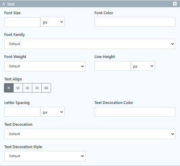
Text
| Name | Description |
|---|---|
| Font Size | Enter the text font size in em, px, percentage, rem or auto size. |
| Font Color | Enter the text's font color as a hex code or use the color picker to select the desired color. |
| Font Family | Select the text's font type. Available options are:
|
| Font Weight | Select the text's font weight. Available options are :
|
| Line Height | Enter the text's line spacing height in em, px, percentage, rem or auto size. |
| Text Align | Choose the text's alignment. Available options are:
|
| Letter Spacing | Enter the spacing width between letters in em, px, percentage, rem or auto size. |
| Text Decoration Color | Enter the text's decoration color as a hex code or use the color picker to select the desired color |
| Text Decoration | Select the text's decoration. Available options are:
|
| Text Decoration Style | Select the text's decoration style. Available options are:
|
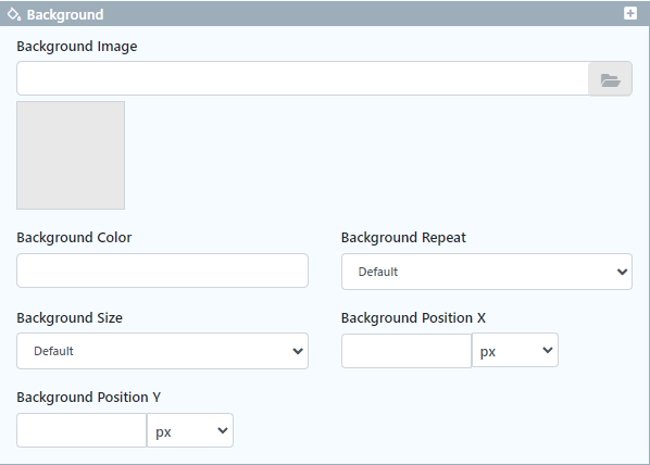
Background
| Name | Description |
|---|---|
| Background Image | |
| Image Preview | |
| Background Color | |
| Background Repeat | |
| Background Size | |
| Background Position X | |
| Background Position Y |
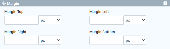
Margin
| Name | Description |
|---|---|
| Margin Top | |
| Margin Left | |
| Margin Right | |
| Margin Bottom |
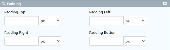
Padding
| Name | Description |
|---|---|
| Padding Top | |
| Padding Left | |
| Padding Right | |
| Padding Bottom |
Border
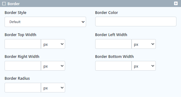
| Name | Description |
|---|---|
| Border Style | |
| Border Color | |
| Border Top Width | |
| Border Left Width | |
| Border Right Width | |
| Border Bottom Width | |
| Border Radius |
Display

| Name | Description |
|---|---|
| Display | |
| Position | |
| Position Top | |
| Position Left | |
| Position Right | |
| Position Bottom | |
| Float |
Size
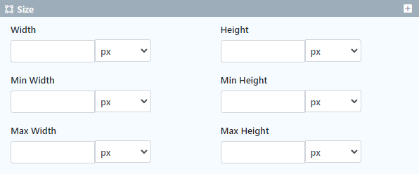
| Name | Description |
|---|---|
| Width | |
| Height | |
| Min Width | |
| Min Height | |
| Max Width | |
| Max Height |
Custom
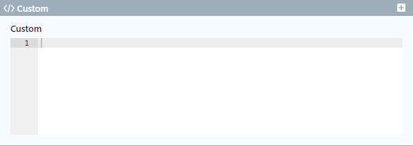
The Custom Styling option allows you to write custom CSS code that will determine the element's styling.
...