| Info | ||
|---|---|---|
| ||
Make sure that you have first completed the previous tutorial - Designing a Form |
| Widget Connector | ||||
|---|---|---|---|---|
|
|
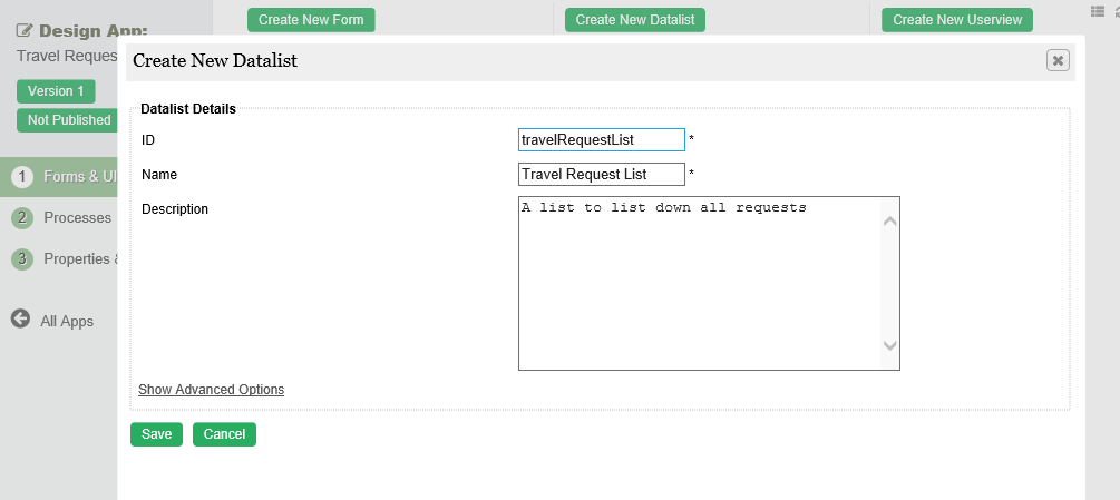
- In the App design page, click on the the Create New Datalist button button along the top.

Key in the details of the new list.
ID: A short and unique ID for each list (no spaces) e.g. travelRequestList
Name: A descriptive name e.g.
 : Optional description.
Name Description ID Unique ID to represent this entity.
Info title Naming convention A standard naming convention is highly recommended to be used across the development of your App to maintain consistency and ease maintenance works.
Camel case naming convention is recommended for this field.
Example: travelRequestList
Name Name to represent this entity.
Info title Example Travel Request List
Description Entity description (OPTIONAL) Duplicate Datalist from With the above information filled up, one can choose to clone the design from existing datalist entity. - Click on Save to Click on Save to save the list and launch the List Dataist Builder in a in a new window. If your browser blocks the popup, click on the list name to launch it.
- The first step in the List Builder is the the Source page page. Here, you can select the source of the data, called called Binders.

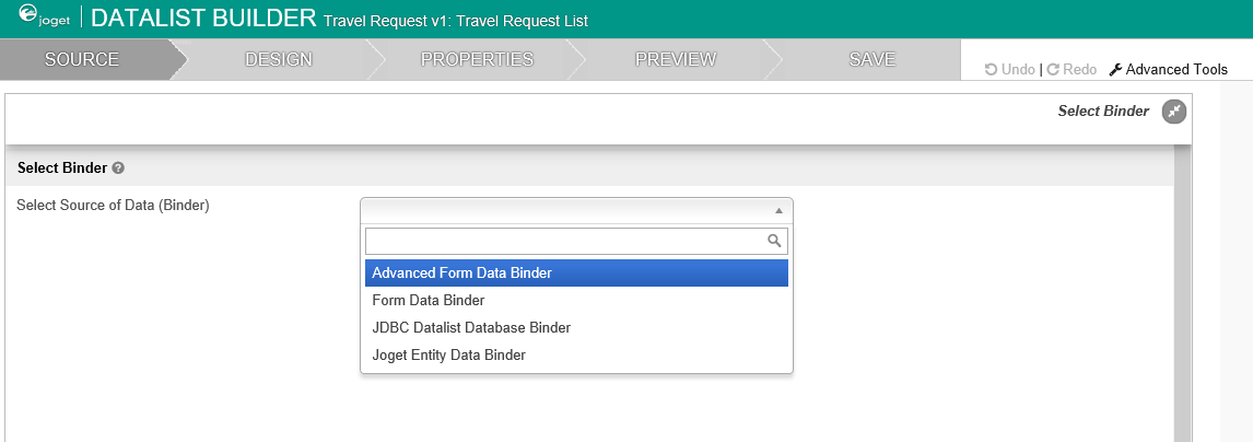
- Select Select Form Data Binder. This binder populates a list based on data captured from Joget forms. Once you select the binder, choose a form then click click OK at at the bottom.


- This brings you to the the Design page page. Here, all available columns provided by the binder are listed in the the palette on the on the left. Drag the desired columns into the the canvas in the in the middle.


- When you hover over a column, buttons appear giving you options to edit or delete the column. Clicking on on Properties opens opens a Property Editor showing properties that you can modify.
- At any time, you may preview the list by clicking on the large large Preview button button at the top.
- Once you have finished designing the list, click on the large large Save button button at the top and you will receive confirmation that the list is saved. You may then continue to design the list, or close the List Builder window.