| Info | ||
|---|---|---|
| ||
Make sure that you have first completed the previous tutorial - Designing a List |
| Widget Connector | ||||
|---|---|---|---|---|
|
|
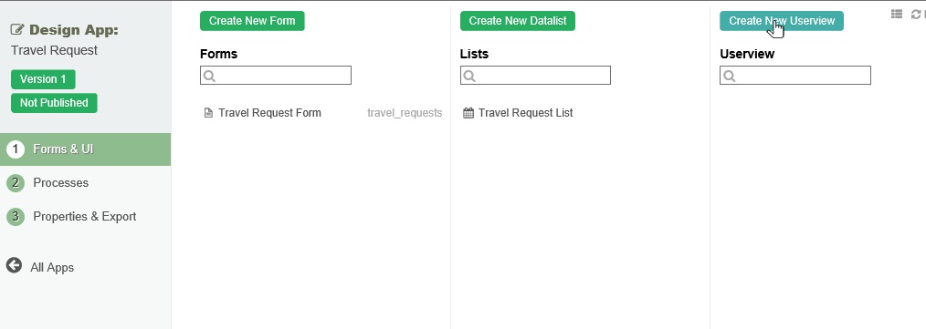
- In the App design page, click on the the Create New Userview button button along the top.

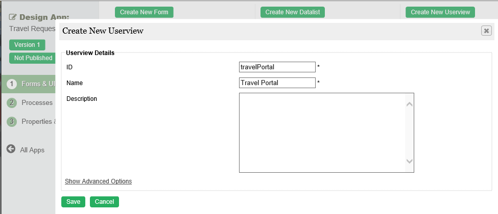
Key in the details of the new userview and click on
thethe Save
button.
ID: A short and unique ID for each userview (no spaces) e.g. travelPortal
Name: A descriptive name e.g. Travel Portal
Description: Optional description.

button.
Name Description ID Unique ID to represent this entity.
Info title Naming convention A standard naming convention is highly recommended to be used across the development of your App to maintain consistency and ease maintenance works.
Camel case naming convention is recommended for this field.
Example: travelPortal
Info title Important Note The ID declared here would be part of the eventual URL seen by the end users. Try to choose something short and meaningful.
Name Name to represent this entity.
Info title Example Travel Portal
Info title Important Note The name declared here would be the userview name seen by the end users. Try to choose something short and meaningful.
Description Entity description. (OPTIONAL) Duplicate Userview from With the above information filled up, one can choose to clone the design from existing Userview entity. - Click on Save to save the userview and launch the Userview Builder in Click on Save to save the userview and launch the Userview Builder in a new window. If your browser blocks the popup, click on the form name to launch it.
- The first step in the Userview Builder is the the Design Userview page page. On the the left is the palette containing available is the palette containing available menu elements. In the middle is the canvas containing the userview userview header, footer and and one or more more menu categories.

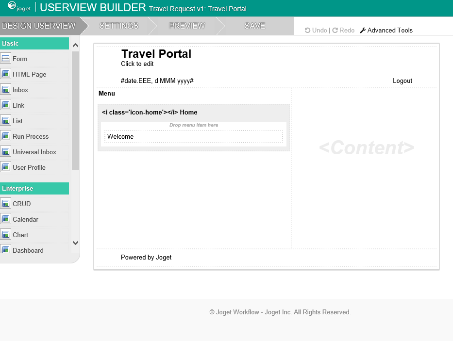
- When you hover over the canvas canvas Menu, a button will appear giving you the option to to Add Category.
- You can click any category name to edit it, and drag categories up and down.
- Drag menu menu elements from the palette into any category.
- Hover over any category or menu element to see the available options.


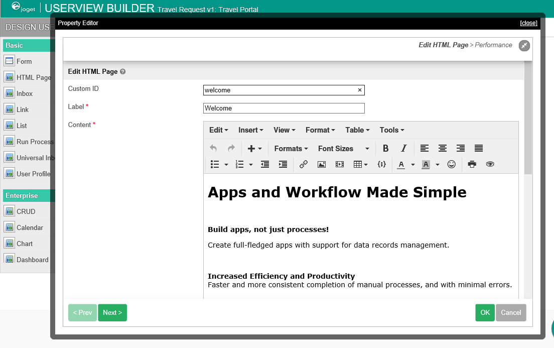
- Click on on Properties button button to modify each menu element's properties.

- At any time, you may preview the userview Userview by clicking on the large large Preview button button at the top.
- Once you have finished designing the userviewUserview, click on the large large Save button button at the top and you will receive confirmation that the userview is Userview is saved. You may then continue to design the userviewUserview, or close the Userview Builder Userview Builder window.
- Before a userview can an Userview can be accessed by a normal user, the app needs to be published. To do that, click on the the Not Published or or Versions link link on the left in the App design page.

- A popup displays all versions of the app. Select the radio button next to the latest version and click on the the Publish button button. Once an app is published, its userviews will Userviews will be available in the App Center.
