...
| English |
|---|
| Chart menu allows you to select a form binder or |
| borderColor | green |
|---|
| borderWidth | 1 |
|---|
| titleBGColor | #ddffcc |
|---|
| borderStyle | solid |
|---|
| title | Definition |
|---|
|
| Chart (Formally known as SQL Chart) allows you to define your own SQL query to determine the charts that you would like to generate, ranging from a number of graph types.display the chart data for the most common graph types. You can also include charts in your userview Dashboard Menu. |
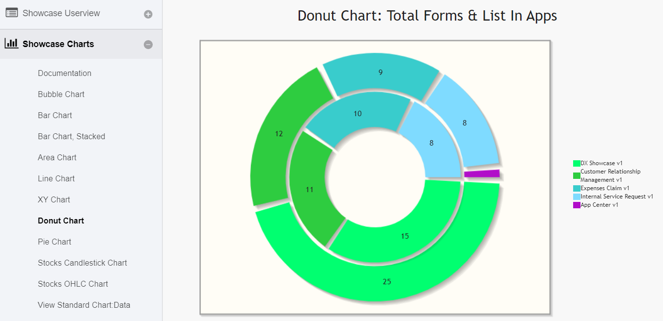 Image Added
 Image Added
 Image Removed
Figure 1: SQL Edit Chart Properties
| Name | Description |
|---|
| ID | Menu element unique id. Userview will use this id in the URL for the menu if the Custom ID is empty. |
| Custom ID | Item link slug. Optional field. |
| Info |
|---|
|
Value Value defined here must be unique to the rest of the Userview Menus as the first matching name will be called upon. |
| Label | Menu label. Mandatory field. |
| Chart Type | - Area Chart
- Bar Chart
- Bubble Chart
- Candlestick Chart
- Donut Chart
- Line Chart
- Open High Low Close Chart (OHLC Chart)
- Pie Chart
- XY Chart
|
| Chart Title | Chart Title to be displayed as part of the generated graph. |
| Panel |
|---|
| borderColor | purple |
|---|
| borderWidth | 1 |
|---|
| titleBGColor | #ddccff |
|---|
| borderStyle | solid |
|---|
| title | New Feature |
|---|
|
This feature has been enhanced in Joget Workflow v6 to support join, group and aggregate function. |
 Image Removed
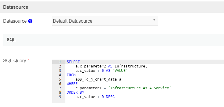 Image Added
Figure 2: SQL Chart Properties - Datasource
| Name | Description |
|---|
| Datasource | - Using Data Binder
- Default Datasource
- Custom Datasource
|
| Panel |
|---|
| borderColor | purple |
|---|
| borderWidth | 1 |
|---|
| titleBGColor | #ddccff |
|---|
| borderStyle | solid |
|---|
| title | New Feature |
|---|
|
New feature in Joget Workflow for more flexible ways to build chart dataset using the existing Datalist Binders. |
| Data Binder | When Datasource is set to "Using Data Binder", this option will show up. |
Please Advance Form Data Binder has more flexible ways to build chart datasets using join, group, and aggregate function. Please see Datalist Binder for the available binder to use. |
| SQL Query | When Datasource is set to use any of the "Datasource", this option will show up. |
You use an SQL Query to produce the dataset required for the graph type. |
| Info |
|---|
The The first column in the dataset will be assumed for the X-axis/label. Example 1:The first column to be returned from the query must be a label (X-axis), followed by value columns for the Y-axis. |
Example 1:codeasAS 'status',
COUNT(c_status) |
|
asAS 'count'
FROM
app_fd_tix_tickets
WHERE
c_status IS NOT NULL
GROUP BY
c_status |
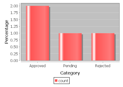 Image Modified Image Modified
Example 2: |
selectsumcastCAST( replace(c.c_total, '$', '') |
|
asdecimalasavgcastCAST( replace(c.c_total, '$', '') |
|
asdecimalasfromhrgroup by Image Modified Image Modified
 Image Modified Image Modified |
 Image Added
 Image Removed
Figure 3: SQL Chart Properties - Data Binder & Chart Data Mapping (applicable for - using Data Binder)Properties
| Name | Description |
|---|
| Order By | Column to be sorted in the graph dataset. This would affect how the graph is plotted. |
| Order | |
X-axis Value | X-axis label. |
Y-axis Values | Y-axis dataset. |
 Image Removed
 Image Added
Figure 4: SQL Chart Properties - Chart Options (applicable for - using Datasource)
| Name | Description |
|---|
X-axis Label | X-axis Label |
X-axis display as | |
Y-axis Label | Y-axis Label |
Y-axis Prefix | Y-axis Prefix |
Show Legend? | If checked, the legend will be shown in the generated graph. |
Show Value Label in Chart? | If checked, the value label will be shown in the generated graph. |
| If checked, this will affect the generated graph. |
Display as Horizontal Chart? | Display as Horizontal Chart. |
| Width | |
.| Code Block |
|---|
|
100% |
| Height | Height in character, example 300px. |
| Colors | Series color. Optional field. Comma-separated values (CSV) of color codes. Example 1: |
| Code Block |
|---|
|
#3333FF,#66FF00,#FF9933,#990000 |
 Image Removed
| Code Block |
|---|
title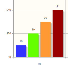 Image Added Image Added
Example
|
red2: red,orange,yellow,green,blue,indigo |
 Image Removed
 Image Added Image Added
|
 Image Removed
 Image Added
Figure 5: SQL Chart Properties - AdvancedAdvanced Properties
| Name | Description |
|---|
Userview Key Name | When defined, the additional |
condition conditions will be appended using the value defined here as the parameter and the userview key value as the value. | Info |
|---|
| SQL: SELECT category, count(category) FROM table1 Userview Key Name: type Userview Key Value: val Resultant SQL: SELECT category, count(category) FROM table1 WHERE type = 'val' |
When userview key value is defined, you may define #userviewKey# in your SQL query to have it replaced with the userview key value. | Info |
|---|
| SQL: SELECT category, count(category) FROM table1 WHERE type = '#userviewKey#' Userview Key Value: val Resultant SQL: SELECT category, count(category) FROM table1 WHERE type = 'val' |
|
| Custom Header in HTML. |
| Custom Footer in HTML. |
You can configure the Performance settings in this Userview Element which allows one to cache existing content for improved performance and loading speed. Read more at Performance Improvement with Userview Caching.
 Image Added
The following code can be modified and put in "Custom Header" for displaying the labels outside of the pie chart.
| Code Block |
|---|
|
<script>
    $(function(){
        $.jqplot.preParseOptionsHooks.push(function(args){
            args.seriesDefaults.rendererOptions.dataLabelPositionFactor = 1.05;
        });
    });
</script> |
| Note |
|---|
The charts are plotted using jqPlot. Head over to their website here to see the full list of available hooks for customization. |
The following code can be modified and put in "Custom Header" property, to hide gridlines from the chart plot.
| Code Block |
|---|
|
<script>
    $(function(){
        $.jqplot.preParseOptionsHooks.push(function(args){
            args.axesDefaults.drawMajorGridlines = false;
        });
    });
</script> |
The following code can be modified and put in "Custom Footer" for interactive ChartCharts.
| Code Block |
|---|
|
<script>
$(document).ready(function(){
    $('#jq_plot_chart').bind('jqplotDataClick',
        function (event, seriesIndex, pointIndex, data) {
            console.log(event);
            console.log(seriesIndex);
            console.log(pointIndex);
            console.log(data);

            //for chart which used legend and x-axis,
            var xaxis = $(".jqplot-xaxis-tick:eq("+pointIndex+")");
            var series = $(".jqplot-table-legend-label:eq("+seriesIndex+")");

            console.log("x-axis :" + xaxis.text());
            console.log("series :" + series.text());
        }
    );

    //for double click event. Please note the arguments are different.
    $('#jq_plot_chart').bind('jqplotDblClick',
        function (event, coordinate, points, data) {
            console.log(event);
            console.log(coordinate);
            console.log(points);
            console.log(data);

            if (data) {
                var xaxis = $(".jqplot-xaxis-tick:eq("+data.pointIndex+")");
                var series = $(".jqplot-table-legend-label:eq("+data.seriesIndex+")");

                console.log("values :" + data.data);
                console.log("x-axis :" + xaxis.text());
                console.log("series :" + series.text());
            }
        }
    );
});
</script> |
| Note |
|---|
This code does not work with OHLC and candlestick chartcharts. |
| Panel |
|---|
| borderColor | purple |
|---|
| borderWidth | 1 |
|---|
| titleBGColor | #ddccff |
|---|
| borderStyle | solid |
|---|
| title | Performance |
|---|
|
You can configure the Performance settings in this Userview Element which allows one to cache existing content for improved performance and loading speed. Read more at Performance Improvement with Userview Caching.
Available in Joget Marketplace