e
| Panel | ||||||||||
|---|---|---|---|---|---|---|---|---|---|---|
| ||||||||||
Form Grid extends the default functionalities of a typical grid element. Unlike the generic grid element that only accepts standard text field for its inputs, the Enhanced Grid Form Element captures data by making reference to another form element. Hence, one can take full advantage of what a typical form element has to offer, e.g., validation and formatting. |
...
| Name | Description | |||||
|---|---|---|---|---|---|---|
| Enable Sorting Feature | Determines if ordering of rows is to be enforced. | |||||
| Field ID for Sorting | Field to keep the ordering sequence; must correspond with a field id in the target form. | |||||
| Form Submit Button Label (Normal Mode) | Label of the Submit button in normal mode. | |||||
| Form Submit Button Label (Readonly Mode) | Label of the Submit button in read-only mode. | |||||
| Display field as Label when readonly? | Displays the value of the element as plain text when element is set to "Readonly". | |||||
| Popup Dialog Height | Specifies the height, in characters.
| |||||
| Popup Dialog Width | Specifies the width, in characters.
| |||||
| Readonly | Determines if the element is editable. | |||||
| Disable Add Feature | Determines if a new row can be added. | |||||
| Disable Delete Feature | Determines if a row can be removed. | |||||
| Delete confirmation message | Confirmation message when deleting a row. | |||||
| Show Row Numbering? | Shows numbering on the grid. | |||||
| Paging Size | Items to be displayed per page. |

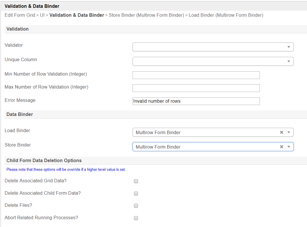
Figure 5: Form Grid Properties - Validation & Data Binder
...
| Info | ||
|---|---|---|
| ||
Download a tutorial app on Grids from Joget Workflow Marketplace to learn more. |
Related Tutorials