| English |
|---|
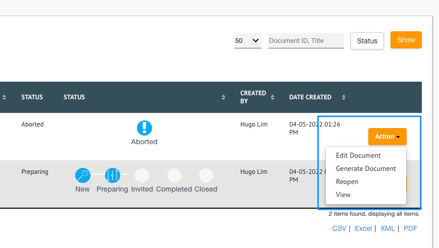
The following sample script is useful to transform a list that contains many action links into a single dropdown select box. This solution is tested on the list with list template "Table - Classic" and with "Display Row Actions in Single Column?" enabled. |
Place these codes in Userview Builder > Settings.
...
| Code Block | ||||
|---|---|---|---|---|
| ||||
<style>
/* Style The Dropdown Button */
#list_form > tbody > tr > td.row_action.footable-visible.footable-last-column > li > a {
  background-color: #4CAF50;
  color: white;
  padding: 16px;
  font-size: 16px;
  border: none;
  cursor: pointer;
}

/* The container <div> - needed to position the dropdown content */
#list_form > tbody > tr > td.row_action.footable-visible.footable-last-column > li {
  position: relative;
  display: inline-block;
}

/* Dropdown Content (Hidden by Default) */
.dropdown-menu {
  display: none;
  position: absolute;
  background-color: #f9f9f9;
  min-width: 160px;
  box-shadow: 0px 8px 16px 0px rgba(0,0,0,0.2);
  z-index: 110;
}

/* Links inside the dropdown */
#list_form > tbody > tr > td.row_action.footable-visible.footable-last-column > li > ul > li > a {
  color: black;
  padding: 12px 16px;
  text-decoration: none;
  display: block;
}

/* Change color of dropdown links on hover */
.dropdown-menu a:hover {background-color: #f1f1f1}

/* Need to modify the anchor tag */
.dropdown-menu a {
    color: black;
    padding: 12px 16px;
    text-decoration: none;
    display: block;
}

/* Show the dropdown menu on hover */
#dropdownBtn:hover .dropdown-menu {
  display: block;
}

/* Change the background color of the dropdown button when the dropdown content is shown */
#dropdownBtn:hover .dropbtn {
  background-color: #3e8e41;
}

.dropdown-menu li{
    list-style-type: none !important;
}
</style> |
Download Demo App
- APP_datalist_action_selectbox_dx_kb.jwa (For Joget DX Progressive Theme)
- APP_datalist_action_selectbox_xadmin_theme_kb.jwa (For Joget DX X-Admin Theme)