| Panel | ||||||||||
|---|---|---|---|---|---|---|---|---|---|---|
| ||||||||||
Label-Value Table allows users to generate a simple label-value table, perhaps to act . Typically used as a legend for charts, appendix table, and so onforth. |
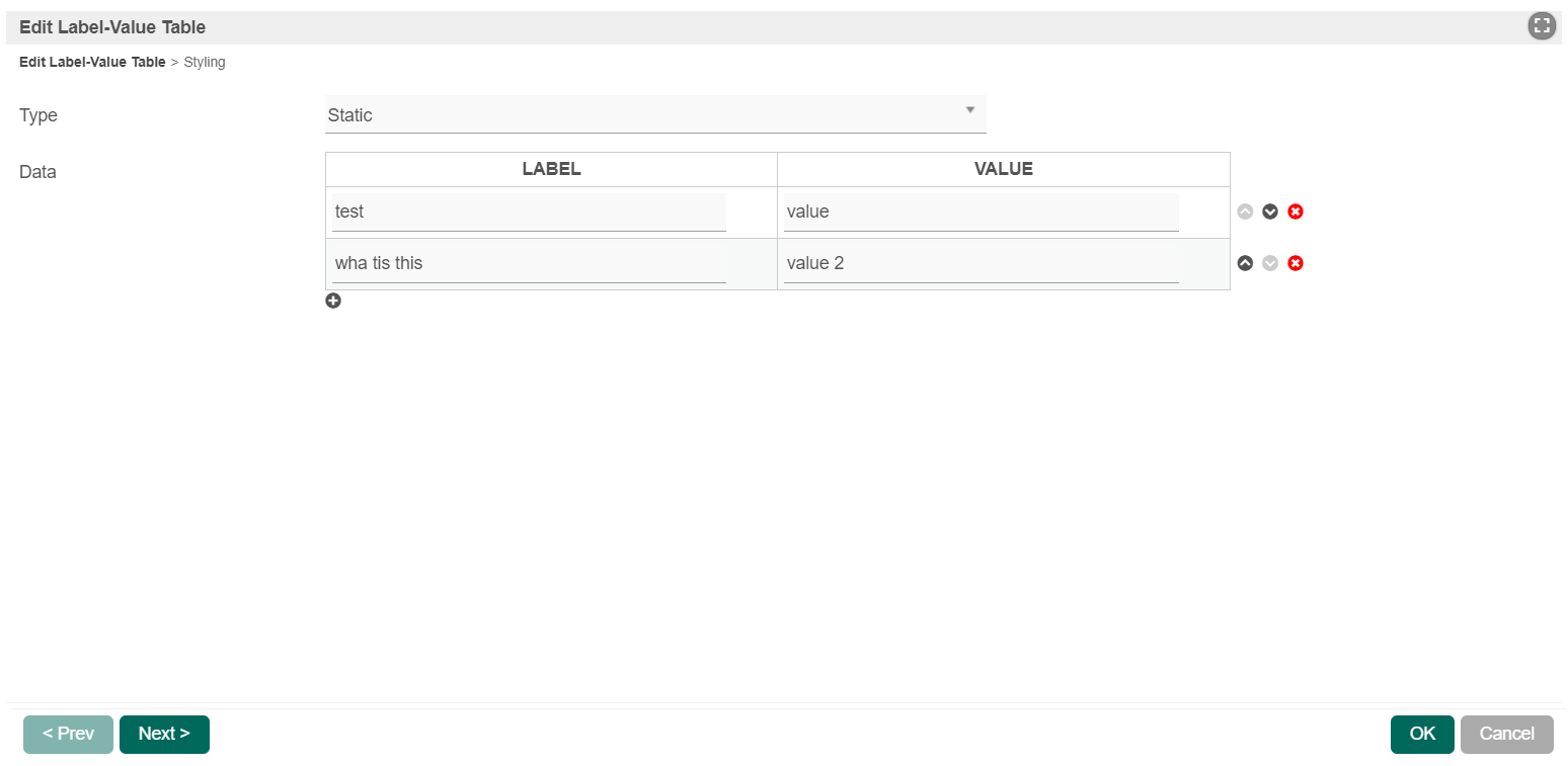

Figure 1: Label-Value Table Properties
| Name | Description | ||||||
|---|---|---|---|---|---|---|---|
Type |
| ||||||
| Data | When Type is set to "Static", this option will show up. The Data properties are defined here:
| ||||||
| Data Binder | When Type is set to "Using Data Binder", this option will show up. Please seeSee Datalist Binder for available binder to use.binders to use. | ||||||
| Label Header | Displays the value here in the header for the label column. | ||||||
| Value Header | Displays the value here in the header for the value column. |
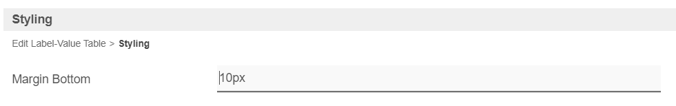

Figure 2: Styling Properties
| Name | Description |
|---|---|
| Margin Bottom | Bottom |
margin of Label-Value Table.
|

| Border Style | ||||||
| Padding | Padding of the Border
| |||||
| Size | Size of the Border Style
| |||||
| Color | Choose the color through the color picker. | |||||
| Style |
| |||||

| Header Style | ||||||
| Bold | If checked, the text will be set to bold. | |||||
| Italic | If checked, the text will be set to italic. | |||||
| Decoration |
| |||||
| Size | Header text size.
| |||||
| Alignment |
| |||||
| Color | Choose the color through the color picker. | |||||
| Background Color | Background color of the header row. | |||||
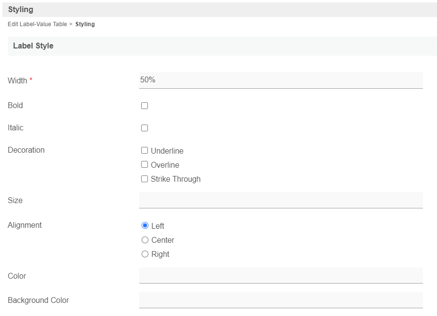
| Label Style | ||||||
| Width | Width of the Label
| |||||
| Bold | If checked, the label text will be set to bold. | |||||
| Italic | If checked, the label text will be set to Italicitalic. | |||||
| Decoration |
| |||||
| Size | Size of the Label StyleText size.
| |||||
| Alignment |
| |||||
| Color | Choose the color through the color picker. | |||||
| Background Color | Choose the Background color through of the color pickerlabel rows. | |||||
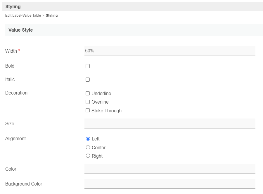
Value Style | ||||||
| Width | Width of the Value
| |||||
| Bold | If checked, the label will be set to bold | |||||
Italic | If checked, the label will be set to Italic | |||||
| Decoration |
| |||||
Size | Size of the Value Style
| |||||
| Alignment |
| |||||
| Color | Choose the color through the color picker. | |||||
| Background Color | ||||||
| Background color |
| of the |
| value rows. |