Introduction
Bootstrap Steps Display is a Form Element and Datalist Column Formatter that allows users to display status in steps with two presentation styles. For example, you can now display steps in icons with color in your form or datalist column.
Get started
Steps To Use Steps Display Form Element Plugin
- Start the Joget server and open the App Center.
- Login as admin and click on Design New App or click on an existing application.

- For a new application, fill up the App ID and App Name then proceeds to click on the Save button.

- Create New Form, fill up Form ID, Form Name and Table Name then click on the Save button.

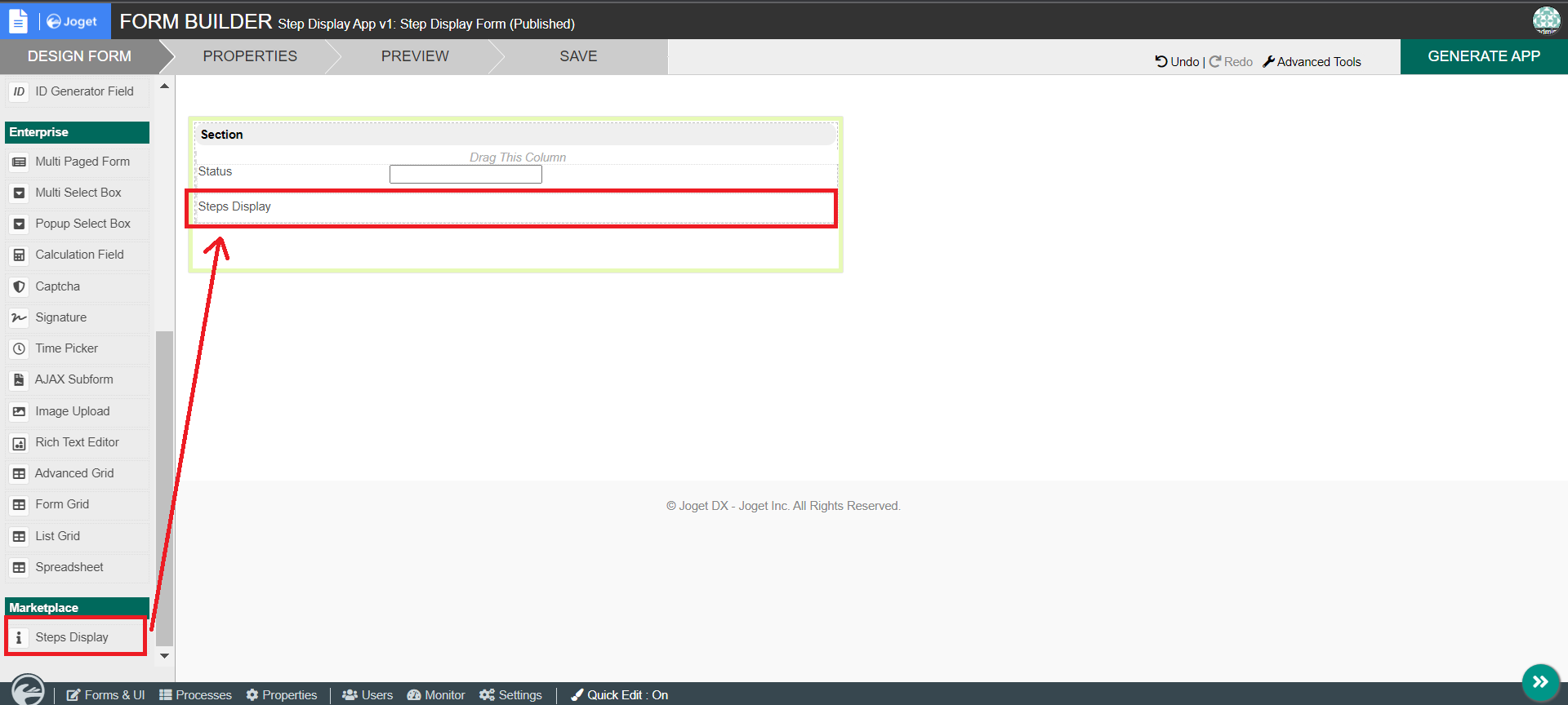
- Fill up the form with a Text Field with the id as status and a Step Display form element then save the form.

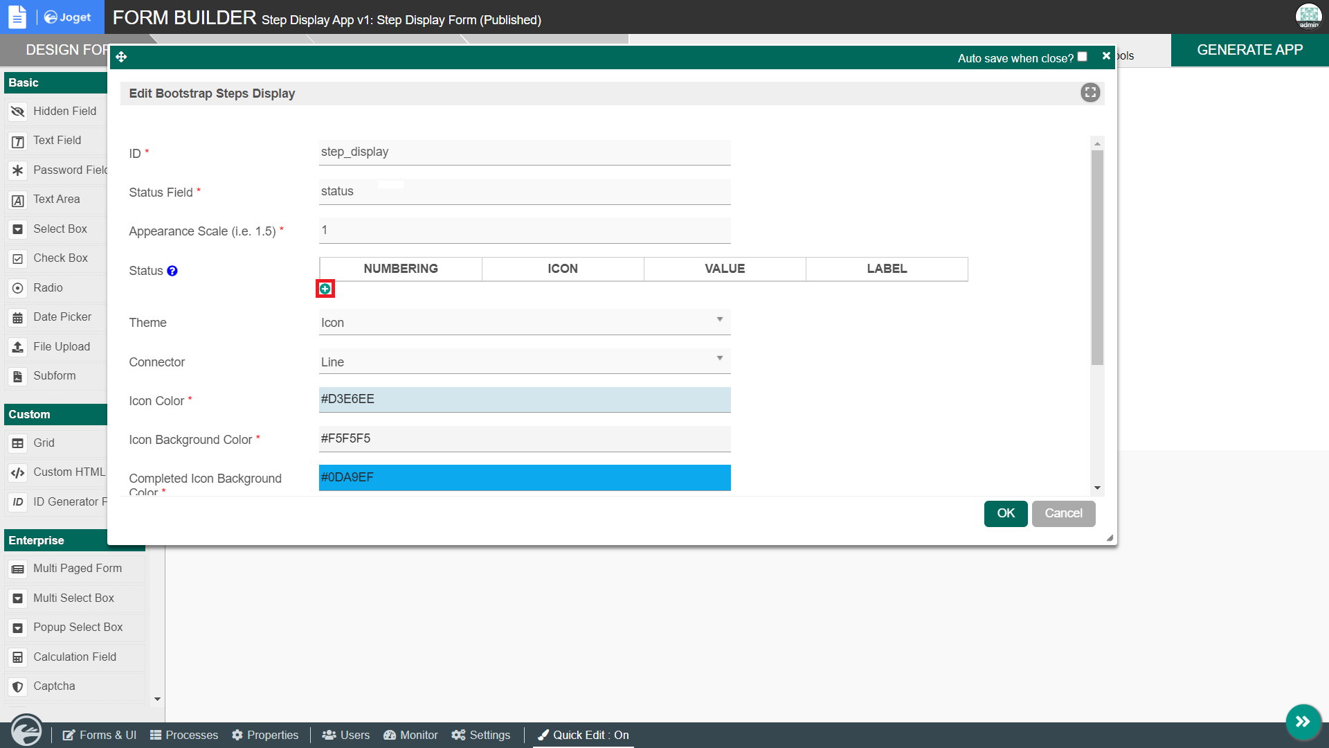
- Edit the Step Display form element by adding a few status and selecting color then save the form.


- Click the GENERATE APP button and generate a CRUD.

- After creating the CRUD, launch the Step Display App Userview.

- Go to the newly created form and click on New button.

- Fill up the status field with one of the values added in the status of Step Display form element and observe the results.

Steps To Use Steps Display Datalist Column Formatter Plugin
- To use the plugin as a datalist column formatter, edit the List - Step Display Form.

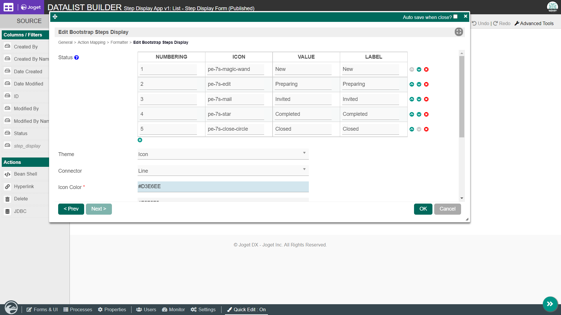
- Edit the status column and add the Bootstrap Steps Display Formatter.


- Edit the column by adding status accordingly and selecting color then save the form.

- Add a new record to the datalist and observe the results.

Step Display Form Element Properties
General

| Name | Description |
|---|
ID | Element ID (By declaring as "step_display", a corresponding database table column "c_step_display" will be created) |
| Status Field | Field ID to control the status of steps. |
| Appearance Scale | To scale and resize the appearance of steps. |
| Status | |
| Theme | Theme of icon. |
| Connector | Shape of connector that connects multiple steps. |
| Icon Color | Color of icon. |
| Icon Background Color | Background color of icons. |
| Completed Icon Background Color | Background color of icons once a step is completed. |
Step Display Datalist Column Formatter
General

| Name | Description |
|---|
| Status | |
| Theme | Theme of icon. |
| Connector | Shape of connector that connects multiple steps. |
| Icon Color | Color of icon. |
| Icon Background Color | Background color of icons. |
| Completed Icon Background Color | Background color of icons once a step is completed. |
