...
| Panel |
|---|
...
|
| English |
|---|
The List Grid is best described similar to a Form Grid, but with the capability to add new records from a List instead. The Advanced Grid is only available on Professional and Enterprise Edition. |
Get Started
The easiest way to see how the List Grid works is to create a new app. Here are the steps:
...
- App ID: listgrid
- App Name: List Grid
...
- Form ID: formA
- Form Name: Form A
- Table Name: lg_a
...
- ID: name
- Label: Name
...
| |||||||||||||
New feature in Joget DX 8 version 8.1 onwardsBulk Deletion
|

...
- ID: formB
- Form Name: Form B
- Table Name: lg_b
...
Columns:
...
Name
...
List Grid Properties
Configure List Grid

...
Element ID (By declaring as "account", a corresponding database table column "c_account" will be created)
Please see Form Element for more information about defining the ID and list of reserved IDs.
...
The columns defined here must be correspondent to the Data List chosen above.
...
Field ID of the target form.
Example:
In the "Account" form sourced in the List "Account Listing", there are Form Elements with the ID "id", and "accountName".
...
If you would like to format the returned value, you may make use of the format type.
Default choice: Text
...
- Text - formats the value as text
- HTML - outputs data as HTML
- Multiple lines text - maintains the spacing formatting for multiple lines text, such as TextArea.
- Decimal - formats as a decimal. The number of decimals is expected in the "Format" field.
Date - formats as a date. Original Date and New Date formats are expected in the "Format" field.
Panel borderColor blue borderWidth 1 titleBGColor #ddffcc borderStyle solid Format: (original format)|(new format)
Example of usage:
Original value: 5/23/2012
Expected value: 2012/5/23
Format : M/d/y|y/M/dNote: Please refer to Java SimpleDateFormat for date format.
File - Show the value as a link to the attachment. Form Def ID is expected in the "Format" field.
Info title Expected Form Def ID Specify the Form Def ID that contains the actual File Upload form element.
Image - Show the value as a thumbnail of the attachment. Form Def ID is expected in the "Format" field.
Info title Expected Form Def ID Specify the Form Def ID that contains the actual Image Upload / File Upload form element.
Options - Show the label of a multiple-choice element given the value given. Form Def ID is expected in the "Format" field.
Info title Expected Form Def ID Specify the Form Def ID that contains the actual Select Box / Radio / CheckBox form element.
...
Column width in characters.
| Code Block | ||
|---|---|---|
| ||
200px |
UI
Sorting

...
...
List

...
...
Form

...
...
...
...
The label of the Submit button in read-only mode.
...
...
Grid

...
Determines if the element is editable.
...
...
...
Determines if a row can be removed.
...
...
...
...
Height in character
| Code Block | ||
|---|---|---|
| ||
500px |
...
...
Width in character
| Code Block | ||
|---|---|---|
| ||
90% |
Data & Validation
Validation

...
Attach a Validator plugin to validate the input value.
| Info | ||
|---|---|---|
| ||
Validation will take place whenever a form is submitted except when it is submitted as "Save as Draft". |
Available options:
- BeanShell (Multirow)
- Grid
...
...
...
...
...
Data Binder
...
...
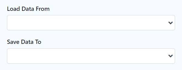
Load Data From allows you to customize the method for data retrieval to populate the list grid in the form.
...
...
Save Data To allows you to customize the method on how the list grid row records are saved to.
This option is empty by default. An empty binder means that the list grid records will be saved/loaded as a JSON format in the parent form & database table. See the list of available Form Binders.
The recommended binder to use is the Multirow Form Binder so that each record is saved into a child database table via a subform definition. The binder will update the foreign key "parent id" into each child record to point to the parent database table.
Child Form Data Deletion Options

...
If the popup form has a grid element(s), this option will delete the inner grid data.
| Panel | ||||||||||
|---|---|---|---|---|---|---|---|---|---|---|
| ||||||||||
These 3 options: (Delete Associated Grid Data, Delete Associated Child Form Data, Delete Files), in combination, does apply to nested grid/child elements. These options traverse the entire form tree. Upon encountering a 'false' condition, it will move on to the next grid/child element. Example: Consider that the popup form has a form grid, form grid has a subform, subform has a file upload element with abc.pdf. If all options are checked, abc.pdf will be deleted. If all except ONE of the options is checked, abc.pdf will NOT be deleted. |
...
If the popup form has a child element(s), this option will delete the child data.
| Panel | ||||||||||
|---|---|---|---|---|---|---|---|---|---|---|
| ||||||||||
These 3 options: (Delete Associated Grid Data, Delete Associated Child Form Data, Delete Files), in combination, does apply to nested grid/child elements. |
...
If the popup form contains a file upload element, this option will delete the actual uploaded file(s).
| Panel | ||||||||||
|---|---|---|---|---|---|---|---|---|---|---|
| ||||||||||
These 3 options: (Delete Associated Grid Data, Delete Associated Child Form Data, Delete Files), in combination, does apply to nested grid/child elements. |
...
Advanced

| Name | Description | ||||||||
|---|---|---|---|---|---|---|---|---|---|
URL Request Parameters for List | Refine the target Data List selections by defining the filter criteria here.
|
...