Table of Contents
Introduction
| English |
|---|
The List Grid is best described similar to a Form Grid, but with the capability to add new records from a |
...
List instead. The Advanced Grid is only available on Professional and Enterprise Edition. |
Get Started
The easiest way to see how the List Grid works is to create a new app. Here are the steps:
- Start the Joget Server and open the App Center.
- Log in as admin and click on the Design New App button. (see Figure 1)


Figure 1 - Fill Select Create A Blank App and fill up the App Details as follows and click Save (see Figure 2):
- App ID: listgrid
- App Name: List Grid

Figure 2 - You will be directed to the Design App Composer. Click on the Create New Form button and fill up the Form Details as follows (see Figure 3):
- Form ID: formA
- Form Name: Form A
- Table Name: lg_a
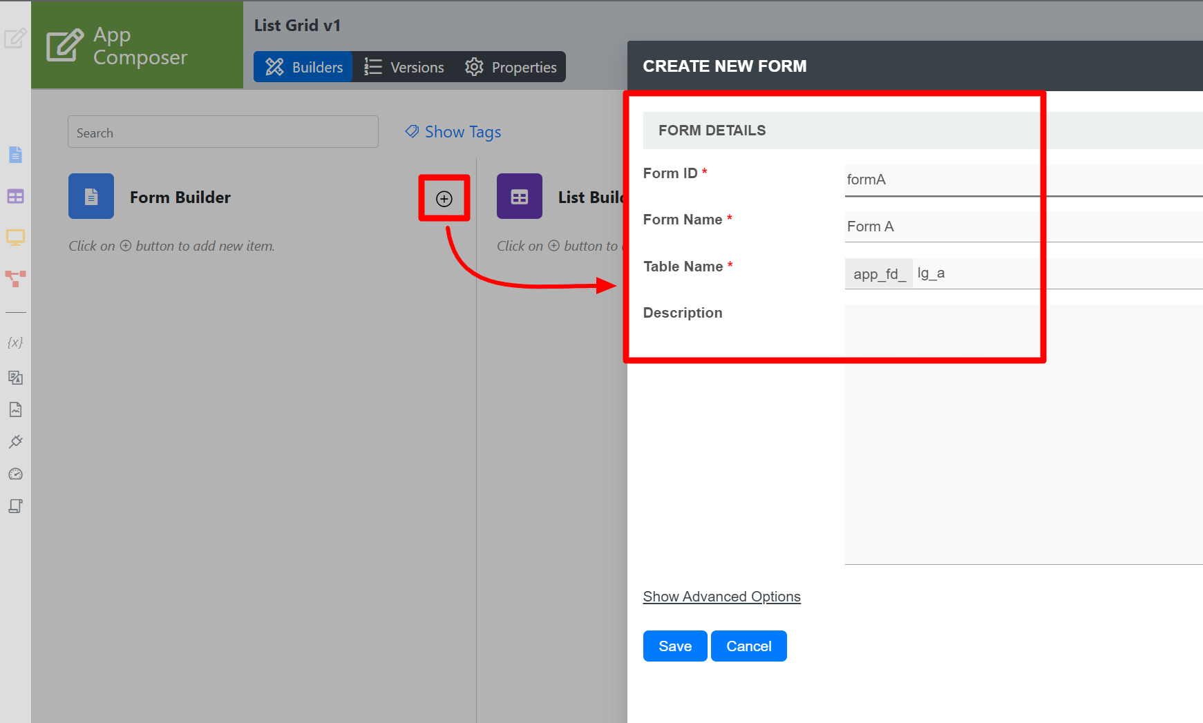
Figure 3 - Click on Save and you will be directed to the Form Builder.
- Drag and drop a Text Field element on to the canvas.
- Hover Click on the mouse over the Text Field element element on the canvas and click on Edit to open up the Edit Text Configure Text Field properties.
- Fill up the Edit Text the Configure Text Field properties as follows and click on OK (see Figure 4):
- ID: name
- Label: Name


Figure 4 - Click Apply Changes and Change and Save the changes on the Form Builder.
- Click on Generate App, select Generate CRUD and click OK Generate (see Figure 5).
- Once the App Generator is complete, click on the link to launch the userview UI.
- Click on New button and Save at least 2 records of data (see Figure 5).

Figure 5 - Head back to the Design App Composer.
- Click on the Create New Form button and fill up the Form Details as follows:
- ID: formB
- Form Name: Form B
- Table Name: lg_b
- Click on Save and you will be directed to the Form Builder.
- Drag and drop a List Grid element on to the canvas.
- Hover the mouse over Click on the List Grid element on the canvas and click on Edit to open up the Edit List Configure List Grid properties.
- Fill up the Edit List the Configure List Grid properties as follows and click on Next (see Figure 6):
- DatalistList: List - Form A
Columns:
Field ID Label name Name

Figure 6 - Click on Preview , click on the plus sign on the List Grid and it will open up a popup list displaying the data you recently entered in step 12. Tick any number of rows and click Submit button. The name of the data selected will be displayed in the List Grid.
List Grid Properties
...
Configure List Grid


| Name | Description | ||||||||||||||||||||||||||||||||||||||||||||||
|---|---|---|---|---|---|---|---|---|---|---|---|---|---|---|---|---|---|---|---|---|---|---|---|---|---|---|---|---|---|---|---|---|---|---|---|---|---|---|---|---|---|---|---|---|---|---|---|
| Label | Element Label to be displayed to the end-user. | ||||||||||||||||||||||||||||||||||||||||||||||
| ID | Element ID (By declaring as "account", a corresponding database table column "c_account" will be created) Please see Form Element for more information about defining the ID and list of reserved IDs. | ||||||||||||||||||||||||||||||||||||||||||||||
| Label | Element Label to be displayed to the end-user. | ||||||||||||||||||||||||||||||||||||||||||||||
| List | List | Datalist | Datalist to display for selection. | ||||||||||||||||||||||||||||||||||||||||||||
| Columns | The columns defined here must be correspondent to the Data List chosen above.
|
UI
Sorting

| Name | Description |
|---|---|
| Enable Sorting Feature | Determines if the ordering of rows is to be enforced. |
Field ID for Sorting | Field to keep the ordering sequence; must correspond with a field id in the target form. |
...
| Name | Description | |||||
|---|---|---|---|---|---|---|
| Readonly | Determines if the element is editable. | |||||
Disable Add Feature | Determines if a new row can be added. | |||||
Disable Delete Feature | Determines if a row can be removed. | |||||
Delete confirmation message | Confirmation message when deleting a row. | |||||
Show Row Numbering? | Show an additional column on the leftmost to denote numbering. | |||||
| Paging Size | Items to be displayed per page. | |||||
Popup Dialog Height | Height in character
| |||||
Popup Dialog Width | Width in character
|
Data & Validation
...
Validation

| Name | Description | |||||
|---|---|---|---|---|---|---|
| Validator | Attach a Validator plugin to validate the input value.
Available options:
| |||||
| Unique Column | Column/Field ID to identify record ID. | |||||
Min Number of Row Validation (Integer) | Min Number of Row Validation (Integer) | |||||
Max Number of Row Validation (Integer) | Max Number of Row Validation (Integer) | |||||
Error Message | Error message to be shown when row requirements set above is not met. |
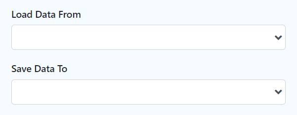
Data BinderStore
| Name | Description |
|---|---|
Load |
Data From | Load |
Data From allows you to customize the method for data retrieval to populate the list grid in the form. |
Save |
Data To | Save Data To allows you to customize the method on how the list grid row records are saved to. This option is empty by default. An empty |
Data Store means that the list grid records will be saved/loaded as a JSON format in the parent form & database table. See the list of available Form |
The recommended |
Data Store to use is the Multirow Form |
Data Store so that each record is saved into a child database table via a subform definition. The |
Data Store will update the foreign key "parent id" into each child record to point to the parent database table. |
Child Form Data Deletion Options
...
| Name | Description | |||||||||||||
|---|---|---|---|---|---|---|---|---|---|---|---|---|---|---|
| Delete Associated Grid Data? | If the popup form has a grid element(s), this option will delete the inner grid data.
| |||||||||||||
| Delete Associated Child Form Data? | If the popup form has a child element(s), this option will delete the child data.
| |||||||||||||
| Delete Files? | If the popup form contains a file upload element, this option will delete the actual uploaded file(s).
| |||||||||||||
| Abort Related Running Processes? | If there are process instances related to the deleted row, these options will abort those process instances. |
| Panel | ||||||||||||||
|---|---|---|---|---|---|---|---|---|---|---|---|---|---|---|
| ||||||||||||||
New feature in Joget DX 8 version 8.1 onwardsBulk Deletion
|

Advanced

| Name | Description | ||||||||
|---|---|---|---|---|---|---|---|---|---|
URL Request Parameters for DatalistList | Refine the target Data List selections by defining the filter criteria here.
|
Download Demo App
- Demo app for List Grid APP_list_grid_dx_kb.jwa .
- Demo app using JDBC in List Grid: APP_list_grid_multirow_jdbc_dx_kb.jwa (using MySQL syntax).