Enhanced Grid Form Element extends the default functionalities of a typical grid element. Unlike the generic grid element that only accepts standard text field as for its inputs, this Enhanced the Enhanced Grid Form Element captures data by making reference to another form element. Hence, one can take full advantage of what a typical form element has to offer, e.g., validation , and formatting.
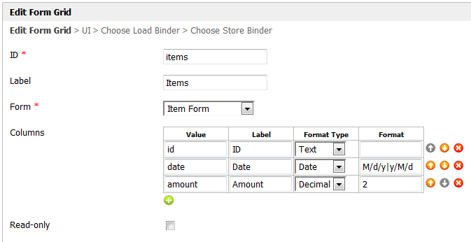
Figure 1: Properties of Enhanced Grid Form Element
ID | Element ID |
Label | Element Label |
Form | Target form to be used for data entry |
Columns | Columns to be displayed in the grid. (Value must correspond to the element id in the target form |
Read-only | Determines if the grid is editable |
Apart from setting up the columns, an external form can also be set to capture more data that than what the grid actually shows. One can also defines define the format on the returned data.
Available Format TypeTypes
- Text - Formats formats the value as text.
- HTML - Output outputs data as HTML.unmigrated-wiki-markup
- *Date* \- Formats as - formats as date. Original Date and New Date format formats are expected in the "*Format*" field.
*
Format*: \ [KB:input format\]\|\[KB:output format\] +
Example of usage+ *:
Original value*: 5/23/2012 *
Expected value*: 2012/5/23 *
Format*: M/d/y\|y/M/d
Note: Please refer to Java SimpleDateFormat for date format. - Decimal - Formats formats as decimal. Number of decimals is expected in the "Format" field.
- File - Show the value as a link to the attachment. Form Def id is expected in the "Format" field.
- Image - Show the value as a thumbnail of the attachment. Form Def id is expected in the "Format" field.

Figure 2: Properties of Enhanced Grid Form Element - UI
Enable Sorting Feature | Determines if ordering of rows is to be enforced |
Field ID for Sorting | Field to keep the ordering sequence; must correspond with a field id in the target form |
Form Submit Button Label (Normal Mode) | Label of the Submit button in normal mode |
Form Submit Button Label (Read-only Mode) | Label of the Submit button in read-only mode |
Display field as Label when readonly? | Displays field values as plain text in target form when Form Grid is set to read-only |
Disable Add Feature | Determines if a new row can be added |
Disable Delete Feature | Determines if a row can be removed |
Delete confirm message | Confirmation message when deleting a row |
Show Row Numbering? | Shows numbering on the grid |
Popup Dialog Height | Target form dimension |
Popup Dialog Width | Target form dimension |
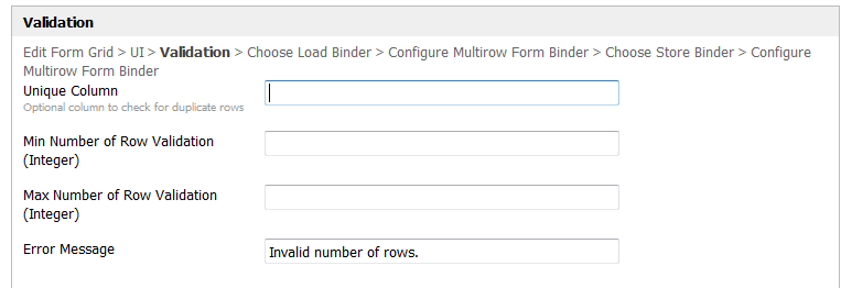
Figure 3: Properties of Enhanced Grid Form Element - Validation
Unique Column | Field to keep the record primary key (e.g., id); must correspond with a field id in the target form |
Min Number of Row Validation (Integer) | Minimum number of rows allowed |
Max Number of Row Validation (Integer) | Maximum number of rows allowed |
Error Message | Custom validation error message |
Enhanced Grid Form Element in a Form
Adding a new row would bring up the external form and upon submission, the data will be stored accordingly in the background and in the columns, with matching IDs.
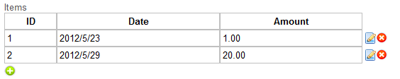
Figure 2: Sample working example 4: Working Example of the Enhanced Grid Form Element
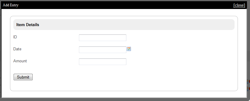
Figure 35: Adding new entry New Entry in the sample working example Working Example of the Enhanced Grid Form Element
Limitation: This element may not work well when the referencing form contains Add a Grid, Enhanced Grid Form Element (Form Grid), Subforms and AJAX Sub Form.