Introduction
Plugin Template Pack aims to factorize repetitive configurations of the same plugin throughout the same app in one place to ease future maintenance. It currently supports:-
- Datalist Formatter
- User view / Form Permission
- Process Tool
- Form Validator
with more plugin types to be supported in the future.
This plugin source code is available in a new open source repository at https://github.com/jogetoss/plugin-template-pack. JogetOSS is a community-led team for open-source software related to the Joget no-code/low-code application platform. Projects under JogetOSS are community-driven and community-supported, and you are welcome to contribute to the projects.
Get Started
The easiest way to see how the Plugin Template Pack function is to create a simple Application. Here are the steps:
Steps To Import This Plugin
1. Go to the website https://github.com/jogetoss/plugin-template-pack.
2. Go to the "Releases" page (See Figure 1).

Figure 1
3. Click on the .jar file to initiate the download (See Figure 2).

Figure 2
4. Go to your Joget Workflow localhost or server and log in as admin.
5. In Joget Console navigate to "Admin Bar > Systems Settings > Manage Plugins" and click the "Upload Plugins" button.
6. In "Upload Plugin", select the plugin .jar file you just downloaded, then click "Upload".
7. You should be able to view the newly installed plugin under the "Installed Plugins" tab.
8. Always uninstall the old plugin before uploading a new version.
9. The Joget Workflow Knowledge Base has more information on managing and developing plugins.
Steps To Use This Plugin
1. Start the Joget server and open the App Center .
2. Log in as admin and click on Design New App (See Figure 3) or click on existing application.

Figure 3
3. For new applications, fill up the App ID with camel case, and App Name, and click on the "Save" button. (See Figure 4)

Figure 4
4. Create a New Form, fill up Form ID in camel case, Form Name, and Table Name then click on the Save button (See Figure 5).

Figure 5
5. Fill up the form with several fields, save it and then click the "Generate App" button (See Figure 6).

Figure 6
6. After Clicking the "Generate App" button, generate the app with CRUD and Datalist included (See Figure 7).

Figure 7
8. After generating the app, Launch the UI Builder by clicking on the newly created CRUD. (See Figure 8).
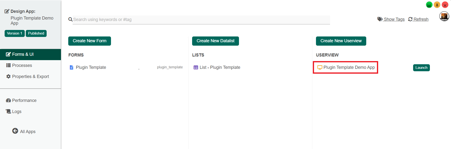
Figure 8
9. Navigate the user view menu elements and add the "Plugin Template Management" to the User view Menu. (See Figure 9).

Figure 9
10. Leave the configuration of Plugin Template Management properties as default and save the User view Builder.
Plugin Template Management Properties
Edit Plugin Template Management

Figure 10
| Name | Description |
|---|---|
| ID | The 'ID' in the property editor is a unique identifier. The value of this property is auto-generated. |
| Custom ID | Item link slug. It is an Optional field. Info Ensure that value defined here is unique to other userview menus in the app since the first matching/conflicting ID will take precedence in page loading. |
| Label | Menu label to be displayed to the end-user. It is a Mandatory field. |
UI

Figure 11
| Name | Description |
|---|---|
| Button Position | The position of buttons in the Userview:
|
| Selection Type | The type record selector in the userview:
|
| Selector Position | The position of the record selector in the userview:
|
| New Record Button Label | New Record Button Label to be displayed to the end-user. Default Value: New |
| Edit Link Label | Edit Record Button Label to be displayed to the end-user. Default Value: Edit |
| Delete Button Label | Delete Record Button Label to be displayed to the end-user. Default Value: Delete |
| Custom Header | Custom Header in HTML. |
| Custom Footer | Custom Footer in HTML |

Figure 11
| Name | Description |
|---|---|
| Cancel Button Label | Cancel Button Label to be displayed to the end-user. Default Value: Cancel |
| Save Button Label | Save Button Label to be displayed to the end-user. Default Value: Save |
| Custom Header | Custom Header in HTML. |
| Custom Footer | Custom Footer in HTML |

Figure 12
| Name | Description |
|---|---|
Back Button Label | Back Button Label to be displayed to the end-user. Default Value: Back |
| Save Button Label | Save Button Label to be displayed to the end-user. Default Value: Edit |
| Custom Header | Custom Header in HTML. |
| Custom Footer | Custom Footer in HTML |
Performance & Offline

Figure 13
Cache Settings
Name | Description |
|---|---|
| Scope | Caching options are:
|
| Duration (s) | Duration in seconds to cache content defaults to 20 seconds if applicable. |
Read Performance Improvement with Userview Caching for more information
PWA Offline Settings
Note: PWA Offline support is dependent on the theme used.
Name | Description |
|---|---|
| Enable cache for offline support | Check this to enable caching for offline support, usually set for use on mobile browsers. |
Read Progressive Web Application (PWA) for more information.
Datalist Formatter
Steps to use the Plugin Template - Datalist Formatter Plugin:
1. Launch the app, navigate to the Plugin Template Management menu, and click the "N ew" button to create a new Plugin Template (See Figure 10).

Figure 10
2. Fill up the Plugin Template Management Page accordingly and for the plugin choose any one of the formatter under Datalist Column Formatter. (See Figure 11)

Figure 11
3. Configure the plugin by clicking the "Configure Plugin" button according to Figure 12 and then submit it.

Figure 12
4. Click the "Save" button to create a Plugin Template for formatting Datalists. (See Figure 13)

Figure 13
5. Click the List - Plugin Template to open the design view of the Datalist builder. (See Figure 14)

Figure 14
6. Preview the Datalist before applying the "Plugin Template - Datalist Column Formatter" for comparing the effect of the Formatter. (See Figure 15)

Figure 15
7. In the Datalist builder go to properties of a column and navigate to General > Action Mapping > Formatter select "Plugin Template - Datalist Formatter" in the Formatter drop-down list. (See Figure 16)

Figure 16
8. Navigate to General > Action Mapping > Formatter > Plugin Template - Datalist Formatter and choose the template that has been created and press OK to apply it. (See Figure 17)

Figure 17
9. Repeat steps 17 and 18 for as many columns as you want in the Datalist and then save it.
10. Preview the Datalist to view the intended effect of the template of Plugin Template - Datalist Formatter. (See Figure 18)

Figure 18
11. Using one Plugin Template created, we can now apply the effect and format of the template to as many columns as we want in the Datalist builder increasing efficiency and reducing the chance of human error. (See Figure 19)

Figure 19
Userview/ Form Permission
Steps to use the Plugin Template - Userview / Form permission:
1. Launch the app "Plugin Template Demo" and create a new template again on the Plugin Template Management Page by clicking the "New" button.
2. Fill up the Plugin Template Management Page accordingly and for the "Plugin" field choose any one of the formatter under Userview Permission or Form Permission . The is Admin is chosen for the Plugin field. (See Figure)

Figure
3. Click the "Configure Plugin" button and as there are no properties to configure for this plugin, submit the plugin and save the template by clicking the "Save" button.
4. The Permission Plugin Template created can be applied to enforce Permission rules to both Form and Userview.
For Userview
1. The Permission plugin template created can be applied at the Userview itself or at the Userview Category level in the Userview using the Permission Control feature.
2. For applying the Permission plugin template at the Userview itself, go to the Userview Builder, select Settings, navigate to Configure Layout > Theme (DX Progressive Theme) > Configure Permission and choose Plugin Template - Permission for the Permission Type field. (See Figure)

Figure
3. Navigate to Permission Type (Plugin Template - Permission) and select the template you have created and save the Userview by clicking the "Save" button. (See Figure)

Figure
4. For applying the Permission plugin template at the Userview Category level, go to the Userview Builder, select the permission icon of the category and choose Plugin Template - Permission for the Permission Type field. (See Figure)

Figure
5. Navigate to Permission Type (Plugin Template - Permission) and select Permission the template you have created, click the "OK" button and save the Userview by clicking the "Save" button. (See Figure)

Figure
The Permission tab in the Advanced Tool ( Advanced Tools > Permission ) of the Userview Builder can utilize the Permission Plugin template created to provide the app designer with fine-grain control over managing the permissions of each individual element in the builder
For Form
1. The Form Permission plugin template created can be applied at the Form or Form Section level using the Permission Control feature.
2. For applying the Form Permission plugin template to the Form itself, go to the Form Builder of the form, select Properties, navigate to Edit Form > Advanced, and choose Plugin Template - Permission for the Permission Type field. (See Figure)

Figure
3. Navigate to Permission Type (Plugin Template - Permission) and select the template you have created and save the Form by clicking the "Save" button. (See Figure)

Figure
4. For applying the Permission plugin template at the Form Section level, go to the Form Builder, select the Edit Section icon of the section, navigate to Edit Section > Data Binder > Advanced Options and choose Plugin Template - Permission for the Permission Type field. (See Figure)

Figure
5. Navigate to Permission Type (Plugin Template - Permission) and select the Permission template you have created, click the "OK" button and save the Form by clicking the "Save" button. (See Figure)

Figure
The Permission tab in the Advanced Tool ( Advanced Tools > Permission ) of the Form Builder can utilize the Permission Plugin template created to provide the app designer with fine-grain control over managing the permissions of each individual element in the builder
Process Tool
Steps to use the Plugin Template - Process Tool:
1. Launch the app "Plugin Template Demo" and create a new template again on the Plugin Template Management Page by clicking the "New" button.
2. Fill up the Plugin Template Management Page accordingly and for the "Plugin" field choose any one of the formatter under Process Tool . The Email Tool is chosen for the Plugin field for this Demo App. (See Figure)

Figure
3. Configure the Email Tool by clicking the "Configure Plugin" button and then click the "Submit" button to save the configuration. S ave the Plugin Template by clicking the "Save" button. (See Figure)
4. The Process Tool Template created can now be used to map the tool in your processes.
5. Go to the Processes tab and navigate to Map Tools to Plugins and map your Process Tools to the appropriate Process Tool Template created by clicking on the "Add/Edit Plugin" button. (See Figure)

Figure
6. After clicking on the "Add/Edit Plugin" button, select Plugin Template - Process Tool. (See Figure)

Figure
7. Select the Template created for your Process Tool and click submit to save your tool mapping. (See Figure)

Figure
Form Options Binder
Steps to use the Plugin Template - Form Options Binder:
Form Validator
Steps to use the Plugin Template - Form Validator:
1. Launch the app "Plugin Template Demo" and create a new template again on the Plugin Template Management Page by clicking the "New" button.
2. Fill up the Plugin Template Management Page accordingly and for the "Plugin" field choose any one of the formatter under Form Validator . As we want to make the form fields "Mandatory", we have to select Default Validator. (See Figure)

Figure
3. Configure the Default Validator Plugin by clicking the "Configure Plugin" button. Make sure the Mandatory property is checked and then click the "Submit" button to save the configuration. Save the Plugin Template by clicking the "Save" button. (See Figure)

Figure
4. Enter the Design View of the Plugin Template Form.
5. Edit one of the fields in the form and navigate to Edit Text Field > Advanced Options and select Plugin Template - Validator for the Validator property. (See Figure)

Figure
6. Navigate to Validator (Plugin Template - Validator) and select the template you have created and click the "OK" button. (See Figure)

Figure
7. Repeat Steps 5 and 6 for as many fields as you want in the Form Builder and then save the form.
8. Launch the app and enter the Plugin Template Form page and the fields that are set with the Plugin Template will have an asterisk (*) to indicate they are mandatory fields. (See Figure)

Figure