Introduction
With CRUD, one will not need to do all the manual wiring in constructing a CRUD entity.
This element provides a userview menu to show the datalist of your choice and selectable forms to associate with the datalist to perform CRUD operations.
CRUD Properties
Edit CRUD
id: Menu element unique id. Userview will use this id in the URL for the menu if the Custom ID is empty.
Custom ID: Item link slug. Optional field.
Ensure that value defined here is unique to other userview menus in the app, since the first matching/conflicting ID will take precedence in page loading.
Label: The userview menu label. You can add Font Awesome Icons into your menu labels.
List: Datalist to load.
Form (Add): Target form to open when adding new record.
Optional field.
If this attribute is not mapped, then ability to add is disabled.
Form (Edit): Target form to open when editing existing record.
Optional field.
If this attribute is not mapped, then ability to edit is disabled.

Figure 1: CRUD Properties

Figure 2: Sample CRUD in runtime
List
UI
Show Number of Rows In Menu: Show number of rows beside this userview menu.
Additional query will be performed to return record count every time the userview loads.
Button Position: Available options:
- Top Left
- Top Right
- Bottom Left
- Bottom Right
- Top Left & Bottom Left
- Top Right & Bottom Right
Selection Type: Available options:
- Multiple
- Single
Selector Position: Available options:
- Left
- Right
- Both let & right
- No
Edit Link Label: Edit link button label to show in listing.
New Record Button Label: New record button label to show in listing.
Delete Button Label: Delete button label to show in listing.
Show Delete Button?: When checked, the delete button will be shown, effectively enabling the deletion capability.
If "Show Delete Button" is enabled, the following options will be shown:
- Delete Associated Grid Data?
- Delete Associated Child Form Data?
- Delete Files?
- Abort Related Running Processes?
Read more in Delete Action.
Custom Header: Custom Header in HTML to show above the listing.
Custom Footer: Custom Footer in HTML to show above the listing.

Figure 3: UI - List Properties
Actions
More Actions: This attribute allows you to add more actions into the listing.
| Field | Description |
|---|---|
| Label | Link label. |
| Hyperlink | Hyperlink URL. |
| Parameter Name | Parameter name to be part of the hyperlink. |
| Column Name | Parameter value to be assigned to the parameter name declared above by defining the column name from the Data List. |
| Confirmation Message | Confirmation message before opening the link. |

Figure 4: Actions - List Properties
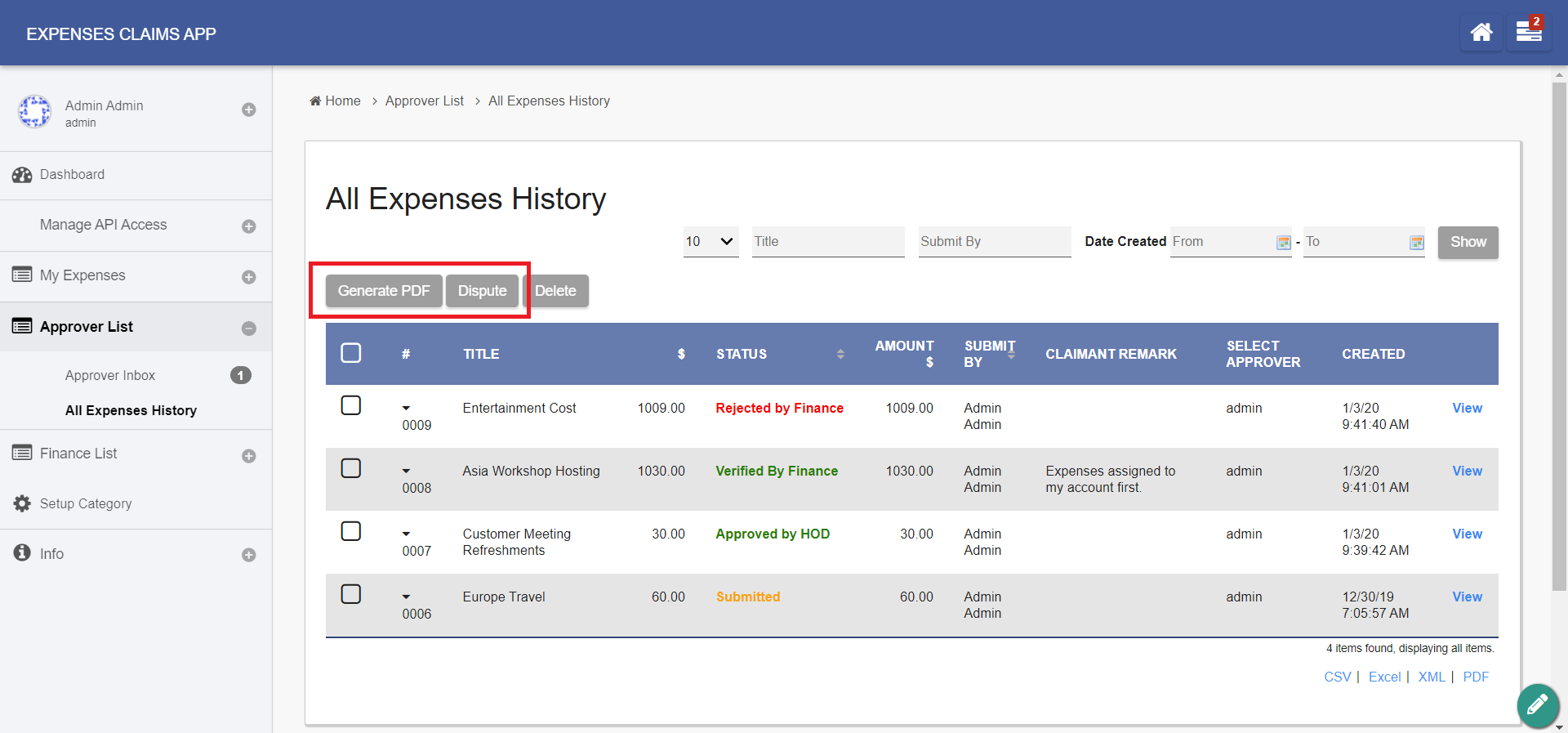
Figure 5: Sample List Actions in runtime
Add
UI
Cancel Button Label: Cancel Button Label to show in add new record form.
Save Button Label: Save Button Label to show in add new record form.
Custom Header: Custom Header in HTML to show in add new record form.
Custom Footer: Custom Footer in HTML to show in add new record form.

Figure 6: UI - Add Properties
Actions
Message to show after Form saved: Message to show after Form saved.
Action to perform after Form saved:
- Return to list
- Continue on Adding Record
- Display in Edit Mode
- Redirection
After Form Saved - Redirection (Hyperlink): Hyperlink URL.
Only applicable when "Action to perform after Form saved" is set to "Redirection".
userviewFormLink
After Form Saved - Redirection (Parameter Name): Parameter to be appended as part of the link defined above.
Only applicable when "Action to perform after Form saved" is set to "Redirection".
Example
id
After Form Saved - Redirection (Field Name): Value to be assigned to the parameter defined above.
Only applicable when "Action to perform after Form saved" is set to "Redirection".
Example
id

Figure 7: Actions - Add Properties
Edit
UI
Readonly: If checked, effectively, the form will be rendered as read only and not editable anymore.
Display Fields as Labels when in Readonly?: When the form is in read only form, determines if values should be displayed as it is (label form) instead of being bounded in original input form.
Back Button Label: Back Button Label. Default value: Back
Save Button Label: Save Button Label. Default value: Save
Record Traversing: Enable record traversing when viewing a individual record in its form. For example, see Figure 9.
First Record Button Label: First Record Button Label. Only applicable when Record Traversing is enabled. Default value: First Record
Previous Record Button Label: Previous Record Button Label. Only applicable when Record Traversing is enabled. Default value: Previous Record
Next Record Button Label: Next Record Button Label. Only applicable when Record Traversing is enabled. Default value: Next Record
Last Record Button Label: Last Record Button Label. Only applicable when Record Traversing is enabled. Default value: Last Record
Custom Header: Custom Header in HTML to show when editing an individual record in a form.
Custom Footer: Custom Footer in HTML to show when editing an individual record in a form.

Figure 8: UI - Edit Properties

Figure 9: Sample record traversing in runtime
Actions
Message to show after Form saved: Message to show after Form is saved
Action to perform after Form saved:
- Return to list
- Continue on edit record
- Continue on edit next record
- Redirection
After Form Saved - Redirection (Hyperlink): URL to redirect to after submission. Only applicable when Action to perform after Form saved is set to Redirection.
After Form Saved - Redirection (Parameter Name): Parameter to be included. Only applicable when Action to perform after Form saved is set to Redirection.
After Form Saved - Redirection (Field Name): Parameter value to be assigned to the parameter above by defining a field ID from the form. Only applicable when Action to perform after Form saved is set to Redirection.
More Actions: Include action buttons to be added into the bottom of the form.
| Name | Description |
|---|---|
| Label | Action button label. Example: New Action Button |
| Hyperlink | URL |
| Parameter Name | Parameter name to be added to the URL defined above. |
| Field Name | Field ID correspondent to the form to retrieve value from and set to the parameter above. |
| Confirmation Message | Confirmation message to prompt before proceeding after clicking on the button. |
For example, see Figure 11.
When such button is clicked, the form will NOT be saved.

Figure 10: Actions - Edit Properties

Figure 11: Sample Edit Actions in runtime
Advanced
Userview Key Name: Define a column name to pre-filter the datalist via the userview key value.
See Userview Key for more info.

Figure 12: Advanced Properties
Performance & Offline
Cache Settings
Name | Description |
|---|---|
| Scope | Caching options are:
|
| Duration (s) | Duration in seconds to cache content, defaults to 20 seconds if applicable. |
Read more at Performance Improvement with Userview Caching.
PWA Offline Settings
Note: PWA Offline support is dependent on the theme used.
Name | Description |
|---|---|
| Enable cache for offline support | Enable caching for offline support, usually set for use on mobile browsers. |
| Cache list actions (Non post action) | Enable caching for any non-POST list actions (if any) in the datalist. |
| Cache all datalist links in first page | Enable caching for any datalist links present in the first page of this userview menu. |
Read Progressive Web Application (PWA) for more information.