Advanced Grid is best described as a Grid with rich inline editing transformation.
Depending on the target field, the Advanced Grid element would mimic the original target type for accurate and richer data entry capability.
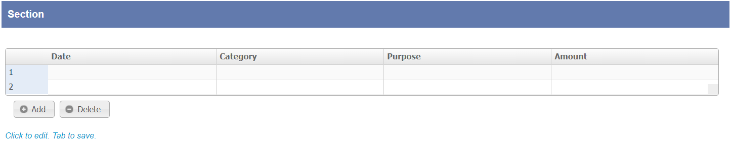
Figure 1: Advanced Grid form element

Figure 2: Screenshot highlighting Advanced Grid on Date Picker element
A Date Picker will show up when editing if the source field itself is a date picker element.

Figure 3: Screenshot highlighting Advanced Grid on Select Box element
A Select Box will show up when editing if the source field itself is a select box element.

Figure 4: Advanced Grid Properties
| Name | Description | ||||||||||||
|---|---|---|---|---|---|---|---|---|---|---|---|---|---|
| ID | Element ID. (By declaring as "entries", a corresponding database table column "c_entries" will be created) | ||||||||||||
| Label | Element Label to be displayed to end user. | ||||||||||||
| Form | Target form for record editing. | ||||||||||||
| Columns | The columns defined here must be correspondent to the Form chosen above.
|

Figure 5: Advanced Grid Properties - UI
| Name | Description |
|---|---|
| Search | Enable search capability within the grid data itself. |
| Readonly | Determines if the element is editable. |
| Disable Add Feature | Determines if a new row can be added. |
| Disable Delete Feature | Determines if a row can be removed. |
| Default Sorting Column Number | Defines the column index to sort by default. This field accepts integers starting from 1 onwards only. Example: If the grid has 5 columns, inputting a "4" will sort the 4th column from the left in ascending order. |
| Sort in descending order? | This option is only available once there is input in "Default Sorting Column Number". Check to sort in descending order instead. |
| Delete confirmation message | Confirmation message when deleting a row. |
| Show Row Numbering? | Shows numbering on the grid. |
| Key to save cell | Keyboard key to use to determine when to save and move on to the next cell. |
| Edit hint | Edit hint message. |
| Record Per Page | Paging Parameter - Record to show per Page |
| Paging Options | Paging Parameter - Paging Options |
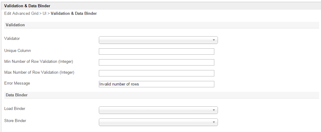
Figure 6: Advanced Grid Properties - Validation & Data Binder
| Name | Description |
|---|---|
| Validator | Attach a Validator plugin to validate the input value. Please see Form Validator. When will validation takes place? Validation will takes place whenever form is submitted except when it is submitted as "Save as Draft". |
| Unique Column | Column/Field ID to identify record ID. |
Min Number of Row Validation (Integer) | Min Number of Row Validation (Integer) |
Max Number of Row Validation (Integer) | Max Number of Row Validation (Integer) |
Error Message | Error message to be shown when row requirements set above is not met. |
Load Binder | Option by default. Grid data will be saved/loaded in JSON format in its defined database cell. In this example, Multirow Form Binder is used to load data from other form. See list of available Form Binder . |
Store Binder | Option by default. Grid data will be saved/loaded in JSON format in its defined database cell. In this example, Multirow Form Binder is used to load data from other form. See list of available Form Binder . |