Userview Builder lets you design the front-end interface in a matter of minutes. You may choose from the list of preloaded themes, or you may develop your own theme.

Figure 1: Userview Builder
Components
Red - Menu bar
Purple - Userview Elements Palette
Blue - Design content pane
Userview Elements
Settings
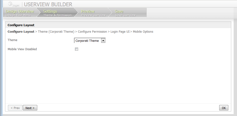
Figure 2: Userview Builder - Settings
In the Settings tab, one may customize the overall presentation of the Userview.
In the first tab itself, one would be able to select the Userview Theme that would define the overall look and feel of the Userview. Subsequent tabs would further refine the theme/Userview itself (e.g. Javascript, Permission Control, Mobile Options, Custom Header/Footer/CSS)

Figure 3: Mobile Options
General Attribute |
Description |
|---|---|
Mobile Offline Cache Enabled |
|
Mobile Login Required First |
|
UI Attribute |
Description |
|---|---|
Mobile View Background URL |
|
Mobile View Background Color |
|
Mobile View Background Style |
|
Mobile View Translucent Effect |
|
Mobile View URL |
|
Mobile View Width |
|
Mobile View Height |
|
Mobile View Logo Alignment |
|
Mobile View Custom CSS |
|